Case Study: Sustainably Kind Living
Creating a comprehensive visual brand identity to amplify a sustainable family and lifestyle brand.
Brand Strategy / Visual Identity / Digital Applications
Experts in helping small sustainable brands be seen and using humor to bring awareness on how we can all live more sustainably and in tune with one another.
Brand Evolution
Where SKL Started
Sustainability Kind Living started as a way to showcase the values and ethics in a niche that lit up founder Danielle Alvarado. Having grown up in Chicago with zero sustainability knowledge, SKL was born to support others on their journey towards a life of more joy, love, and less crap (AKA wastefulness.) The blog has since seen rapid growth and was ready for a cohesive and impactful visual identity.
Where SKL is Going
Now having created a fulfilling career and working from a place of rest. Sustainably Kind Living is growing into a full multifaceted lifestyle brand. Key new offerings include a larger digital presence that will enhance the highly successful blog. We created a robust brand with many attributes to pull from and increase brand awareness. We love how passionate this brand is about their audience and aims to be a resource that encourages them to live a little kinder. Kinder towards themselves, each other, and our planet as a whole.
Brand Keywords
Honest, Kind, Wise, Light-Hearted, Educational
Brand Values
Transparency, Community, Sustainability, Humanity
Target Audience
This family-focused blog’s main audience is mothers who understand the importance of teaching their children the bigger picture. They seek to unlearn what they have been taught and develop a new way of seeing and living in the world. One through a lens of compassion, community, and connection. They seek to live holistically with nature and pass this down to their children and future generations.
Visual Rationale
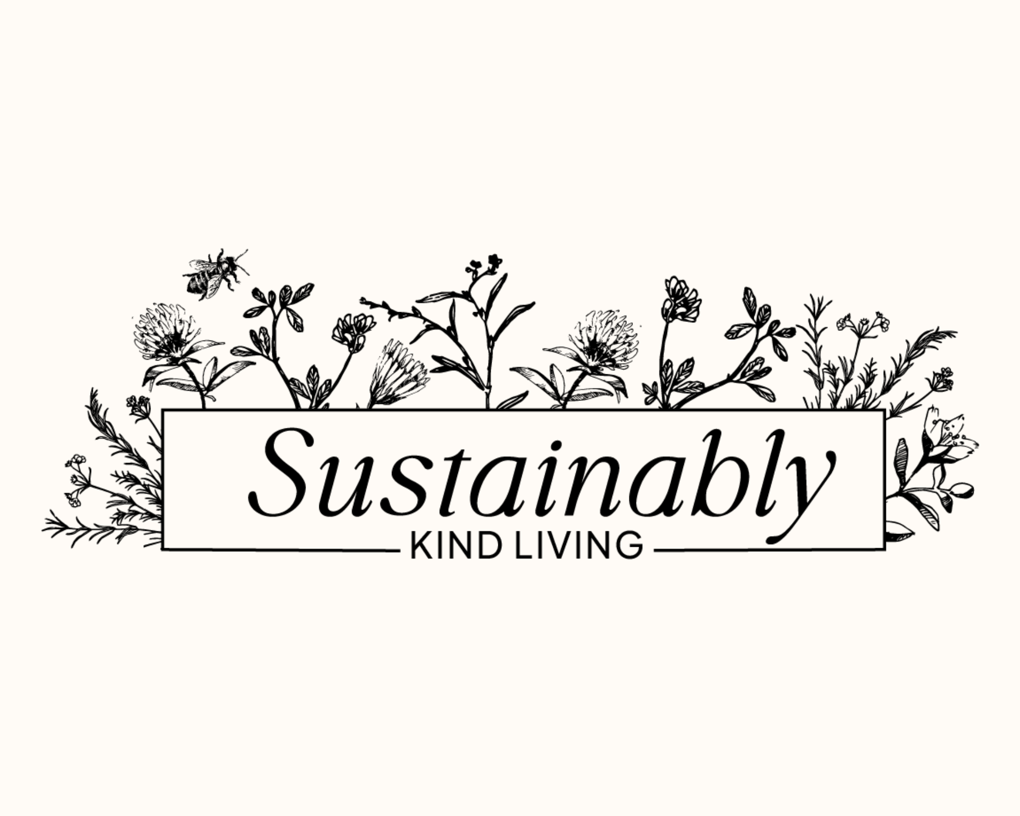
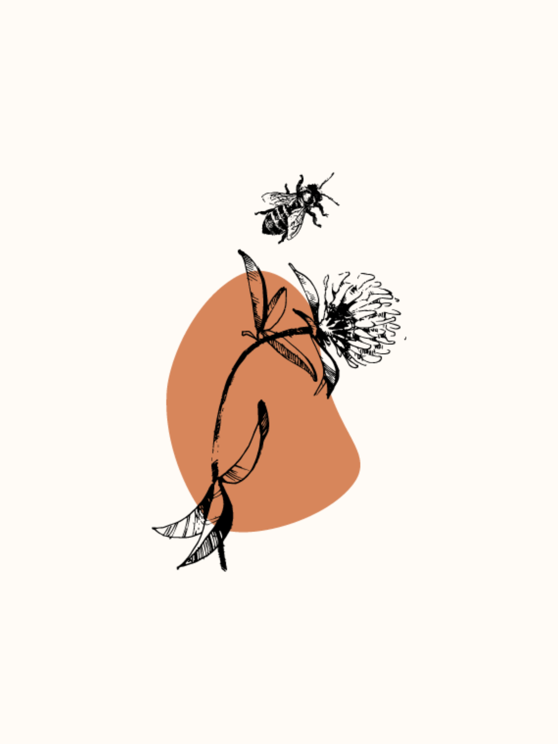
The primary logo is a callback to founder Danielle’s roots of learning sustainable living in the countryside of Italy. With curated plants that are all considered weeds, the logo pairs these lesser-known florae with a warm italicized serif font. This creates a brand that visually feels classic and trustworthy but still feels firmly in the modern era. The brand’s colours are focused around naturally occurring shades that recall earthy warm colours that connect the viewer to what sustainability is all about: Mother Earth. The brand icon is a clover and bee, which are the very crux of many ecosystems that we as humans rely on. This imagery helps ground the brand and serves as a reminder of why sustainability matters.


