Bowness Soapworks Case Study: Transforming Sustainable Soap into Online Success
Fueled by the spirit of adventure, a dynamic visual brand is born – a blend of adventure, fun, and togetherness.
Brand Strategy/Visual Identity/Digital Applications/Print and Merchandising
At the heart of Bowness Soapworks lies an unwavering dedication to the thrill of adventure. A brand that believes in fostering connections, sharing laughter, and creating memories together. The result is an embodiment of adventure, fun, and communal harmony in every product they offer, inviting you to experience a piece of our spirited ethos with every use.
Brand Evolution
Where Bowness Soapworks Started
Bowness Soapworks had its humble beginnings where Founder Melba's creative flair and entrepreneurial drive converged. With an unyielding passion for the great outdoors and a deep-rooted commitment to fostering community bonds. Drawing from her wellspring of creativity, she ingeniously crafted a product that seamlessly wove together these intrinsic elements. The result was more than just soap – it was a testament to her boundless imagination, a tangible bridge uniting her love for creativity, the outdoors, and the spirit of communal togetherness.
Where Bowness Soapworks is Going
As Bowness Soapworks continues to thrive, propelled by a growing and enthusiastic clientele, the demand for soap club memberships and engaging workshops has become a cornerstone of their journey. Eager to evolve and capture the essence of the vibrant brand, they recognized the need for a revitalized identity that authentically embodies a spirited essence and audacious vision. The brand refresh is more than just a visual transformation – it's a declaration of their unwavering commitment to innovation, community, and boldness. Bowness Soapworks is poised to set new standards in the industry, reflected with dynamic spirit and reimagining the possibilities of what soap and community can be.
Brand Keywords
Bold, Adventurous, Community Focused.
Brand Values
Community, Adventure, Quality, Connection
Target Audience
Bowness Soapworks is uniquely attuned to its ideal clientele – individuals brimming with enthusiasm for their passions. With a profound love for the outdoors ingrained in their very being, these individuals find solace and inspiration in nature's embrace. Thoughtful and considerate in their choices, they are steadfast supporters of local initiatives. The essence of being neighborly is intrinsic to them; they actively seek out opportunities for community engagement and meaningful connections. Bowness Soapworks resonates with these like-hearted souls, offering products that mirror their values and complement their vibrant lifestyles.
Visual Rationale
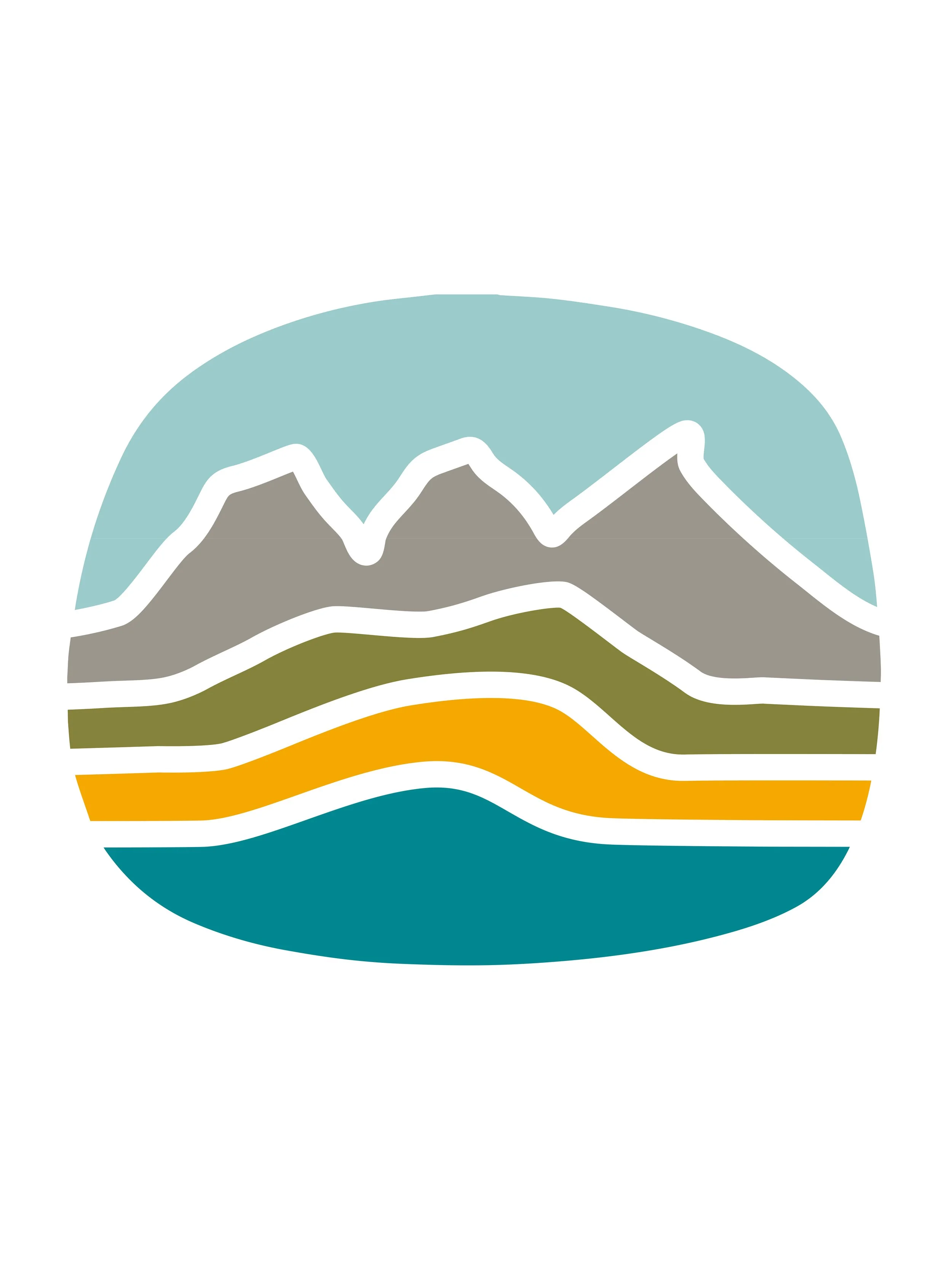
The branding for Bowness Soapworks started with the inspiration of the Three Sisters mountains in Canmore because founder Melba is an avid rock climber, hiker, forager, and adventurer. We wanted to incorporate this into the brand and also play off the bold & bright colors found in outdoor gear. The main logo is a line-art stamp image of the mountains, foothills, fields, and rivers that are present in Alberta, and are the foraging grounds for many of the soaps made by Bowness Soapworks. We created a fun topography-inspired pattern to add visual interest & have a callback to the mountains in the packaging and website design. By focusing on a strong brand symbol that is easily recognizable and paired with bold colors, we created a playful & adventurous soap brand that stands out in the handmade soap niche.


